Portfolio ⮞ MSOE Website Restructure
MSOE Website Restructure
Project Overview
UX 2024 Information Architecture
Team of 3
Februray 2023 | 3 Weeks
In my Winter 2022-2023 Information Architecture class, my team of 3 was tasked with auditing and redesigning one section of the msoe.edu website. My team met with the client, the MSOE Digital Marketing Department to understand known problems the department had with the site.
Project Goal
Our goal was to audit the first level of the msoe.edu site and evaluate the effectiveness of the current organizational structure, followed by delivering a proposed solution in a presentation and a design brief.
Personal Contributions
I worked with my team to split up responsibilities evenly. I contributed to the success of the project by:
- Performed high level content audit: I worked with my team to determine problems areas on the msoe.edu home page as well as indicate design features that worked well to keep in the redesign.
- Conducted a card sort: I was responsible for conducting two card sorts with end users to learn how they would categorize and organize the current pages and how it differs from how the navigation is currently structured.
- Created medium-fidelity wireframe: I created a med-fi wireframe in Figma that reflected my team’s ideas on how to rearrange the content on the MSOE home page to better serve the people that visit it.
- Captured team’s thoughts in design brief: I documented the design process and design rationale of the team in the style of a design brief. This document outlines key changes my team made for our proposed design as well as addressed client feedback.
Project Results
My team received good feedback from our peers and the client, with no glaring areas of missed opportunity. Our professor commented on the fact that my team made the decision to limit the scope of this project to just the top level of the msoe.edu site and the home page, as our prompt was the most open-ended of the class.
Design Brief
Prepared by Jalen Akinsanya, Luka Malovic & Debra Nygren, students in UX 2024
Prepared for Joshua Hertzog, Director of MSOE Digital Marketing Department
Table of Contents
Project Overview
Design Goal
Of the three goals you shared with the class, our team ended up working on the MSOE Home Page. Specifically, the goal was:
“How can we organize and design the homepage content to make it more effective for users? We’d especially like to call more attention to the campus events calendar, so what would be recommendations to do so?”
Content Audit Findings
Key Findings
- Flow of content on Home Page works well
- Easy to skim
- Hero carousel is dynamic, provides visual interest
- News section easy to find
- Industrial Engineering section provides statistics at a glance
The majority of information gathered from the content audit revolves around URLs, but some attention was given to other content.
Because of our focus on the home page as a whole, the URL crawler had to go through practically every link on the site. The trial version of this program was used, so only 500 URLs were audited, and this created a problem because most URLs fell outside of the scope of this project.
Few to none of the images on the site have any alt text, which is important for making the webpage accessible to those who use screen readers; we recommend adding alt text for this reason.
Around 50 child pages of the News page are missing page titles, and 77 pages are missing page titles in total according to our web crawler. We recommend that each News article have a page title that matches or abbreviates the article title.
Card Sort Findings
Key Findings
- Participants did not come up with entirely consistent category names
- Participants could not agree on where to put certain labels, such as “Dean of Students” and “Commencement”
- Participants unanimously made a category for “News”
- Most participants made categories like “Prospective Students,” “About MSOE,” “Campus Life,” and “Academics”
Similarly, to the limitations of the site crawler, our card sort tool limited us to 20 cards on account of us using the free version. As such, there was a small bit of inference that had to be done on our part in terms of organizing the remaining labels based on the results of those 20.
For example, the “Undergraduate Degrees”, “Graduate”, “Minors” and “Certificates” pages were combined into one card titled Degree Programs to save on cards.
Client Feedback
Key Findings
- Less is more regarding the number of columns in the top-level navigation
- Campus events aren’t exactly news, and as such do not belong under the “News” column
- Having the events at the top of the page is a good change
- Investigate the “Visit MSOE” page further to determine whether it actually warrants a rename to “Tour MSOE”
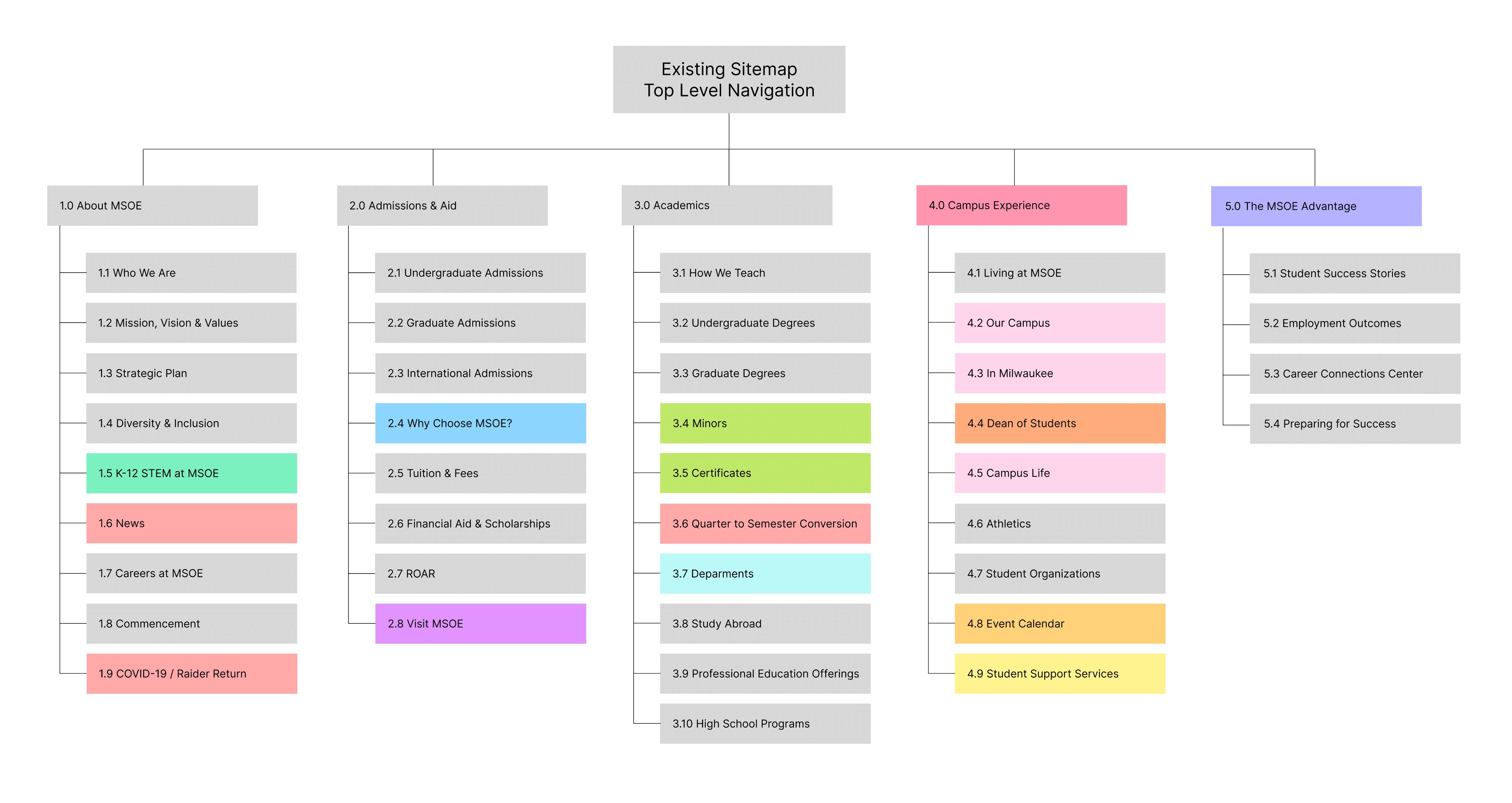
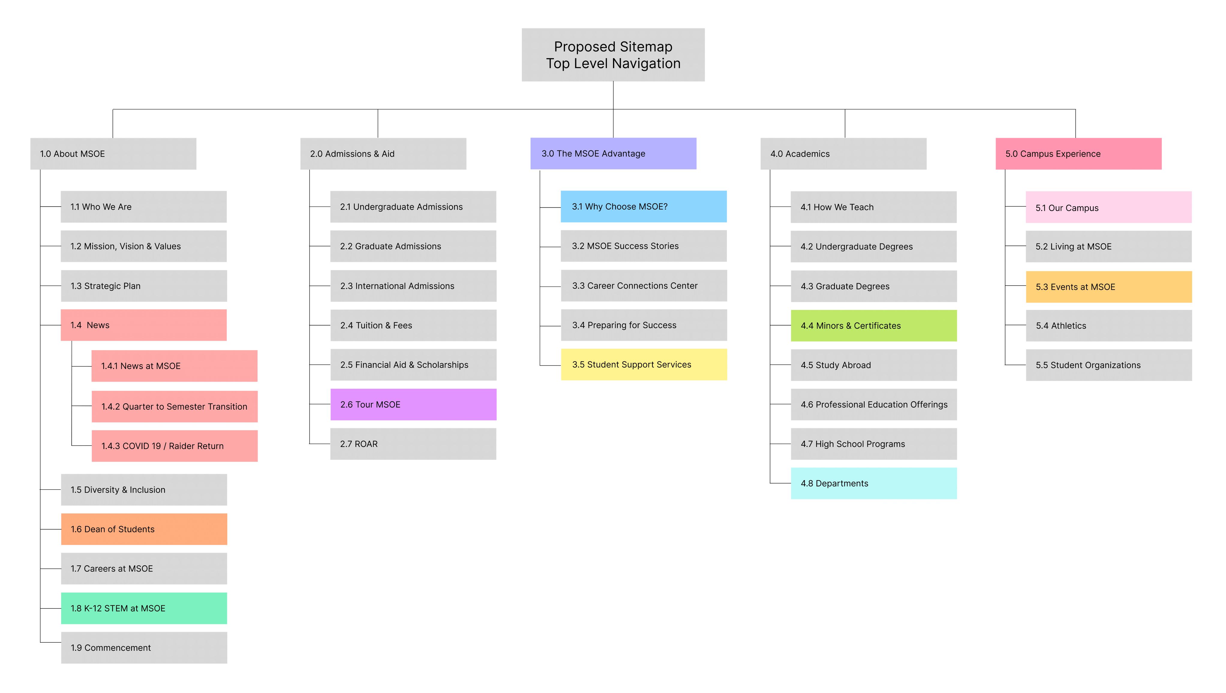
Our first design iteration had six columns in the top-level navigation: “About MSOE”, “Admissions & Aid”, “The MSOE Advantage”, “Academics”, “Campus Experience” and “News”. We had a feeling this was a bold choice and ultimately decided to remove the “News” column and move its contents underneath “About MSOE”.
Final Sitemap & Wireframe
Sitemap
Please note that the color coding indicates labels that were concatenated, moved, and/or renamed from the existing sitemap.


Wireframe
Figma wireframe is embedded below, and is also available here. Press "Z" to toggle the zoom mode, Fit Width is reccomended.
Design Rationale
Key Changes
- Moved MSOE Advantage up
- Combined Our Campus, In Milwaukee and Campus life
- Moved some pages underneath News
- Renamed some pages to lessen ambiguity
- Reduced size of hero carousel and added controls
- Moved 3-event preview to top of page
- Reworded Welcome to MSOE to Explore MSOE – given that it’s toward the bottom of the page
- Removed photos on photos
Regarding the Home Page
The current size of the hero carousel is overwhelming, and the visitor is unable to control the carousel. Our wireframe resizes the banner and adds arrows to remedy these issues.
We moved the three-event preview up from the middle of the page to the newly created space from resizing the hero carousel. Bringing the events to before the fold will bring more attention to them, meeting the design goal. The functionality of the events preview would stay the same from the current website.
The industrial engineering facts and stats section was moved above the extraordinary together section as we saw it as a method of advertising MSOE to prospective students and wanted to draw attention to it.
At the bottom of the page is the photo gallery. We changed the main text from “Welcome to MSOE” to “Explore MSOE” because having the word ‘Welcome’ at the bottom of the page seemed wrong.
We also removed the thumbnail photo for each of the three gallery sections, as it was pointed out during the initial client meeting that the photos on top of photos was undesirable. We kept the one photo as the background of the section.
Regarding the Top-Level Domain
We renamed “Visit MSOE” to “Tour MSOE” to avoid language barnacles – that is, ambiguous language that obfuscates the meaning that the language represents. In this case, we felt that this renaming was appropriate given that the content of the page seemed to largely entail scheduling both in-person and virtual tours of MSOE’s campus.
Similarly, “Events” was renamed to “Events at MSOE” in order to create a consistent naming scheme with other labels like “Careers at MSOE” and “K-12 STEM at MSOE.” The number of columns in the toplevel navigation ultimately remained at 5, as our card sort indicated that most users organized the labels into about that many categories. In terms of the rearranging of labels within the sitemap, this was carried out in accordance with which labels tended to be grouped together by users during the card sort.
Presentation Slide Deck
View the slide deck as a PDF here here or click the image below.
